Hello Enfold team,
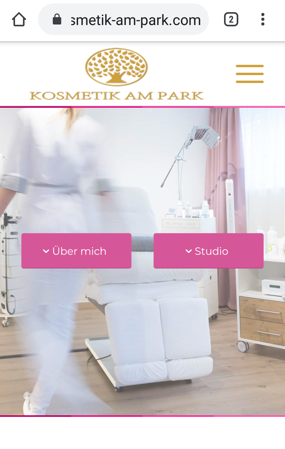
the logo on the mobile devices appears distorted.
This is strange because it was initially displayed correctly.
Since I wanted to place the burger menu on the right and the logo in the middle, I inserted the following CSS code:
#top div .logo {
float: none;
position: absolute;
left: 50%;
z index: 1;
transform: translate3d (-50%, 0, 0);
}
This is the custom CSS code that refers to the logo and it doesn’t seem to be responsible after tests.
Can you help me?
Best regards
Peter
Hey Peter,
Your logo looks fine when I check on mobile using Chrome, could you post a screenshot of the problem and in which device/browser we can reproduce the problem in please?
Best regards,
Rikard
Hi Rikard,
it looks fine in the first Site, but not in the following:

Best Regards
Peter
