
-
AuthorPosts
-
February 14, 2020 at 1:02 pm #1184471
Hello,
i have a problem with the Mobile View, on my Desktop it shows correctly but on my Phone it shows the Layer(Text) very small, i have changed this on the Mobile button see below but it change for all Device like Desktop, Pad and Mobile. I want to change only for Mobile.
Thank u
February 15, 2020 at 6:42 pm #1184786Hey Syosse,
Can you give us temporary admin access to your website in the private content box below, so that we can have a closer look?
Best regards,
VictoriaFebruary 17, 2020 at 10:44 am #1185140Yes of course
February 17, 2020 at 6:32 pm #1185343Hi Syosse,
Best regards,
VictoriaFebruary 17, 2020 at 7:09 pm #1185368Hello its no looking clear see Link:
February 17, 2020 at 9:53 pm #1185430Hi Syosse,
You need to adjust every layer like I adjusted the layer with “Ihr IT Partner”.
Every text is a layer of its own and you need to make settings for them.
Best regards,
VictoriaFebruary 18, 2020 at 4:51 pm #1185737I’ve adjusted every layer. It’s always perfect on the desktop, but it’s messed up on the mobile phone, where can I make settings for mobile View only?
February 20, 2020 at 11:18 am #1186291I have now deleted all Layers why is that so difficult to set it right on mobile view!
The Position of needit is too far down, it must be above as on the desktop.-
This reply was modified 6 years, 1 month ago by
Syosse.
February 23, 2020 at 5:29 pm #1187119Hi,
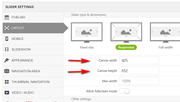
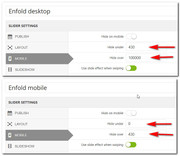
Sorry for the late reply, with the layerslider the best results are achieved by creating two sliders, one for desktop and one for mobile. For your mobile slider go to settings > layout and set the canvas height and width to a size like 425×652.
then when you edit your slider you will see where to place your layers and the size to use based on the mobile size, here you will see I adjusted our slider for mobile to account for the screen width and placement

then under the slider settings > mobile set the size to hide each slider, for example, hide the mobile one over 430px and hide the desktop one below 430px
then on your page add the two sliders:
now for mobile and desktop you will have more control over the size and placement of the layers.
desktop

mobile

You can also find more tips in the layerslider documentation.Best regards,
MikeFebruary 24, 2020 at 11:56 am #1187267Perfect thank you.
the option I was looking for was Slider Setting.
Now i can edit it.
-
This reply was modified 6 years ago by
February 24, 2020 at 2:05 pm #1187339Hi,
Glad we were able to help, we will close this now. Thank you for using Enfold.For your information, you can take a look at Enfold documentation here
For any other questions or issues, feel free to start new threads in the Enfold forum and we will gladly try to help you :)Best regards,
Mike -
This reply was modified 6 years, 1 month ago by
-
AuthorPosts
- The topic ‘Mobile View’ is closed to new replies.