-
AuthorPosts
-
February 3, 2020 at 2:47 pm #1180934
Hi.
I wondered if there’s a way to have two columns side by side, one of which is the width of the website container, the other with a width set by the browser window.
Imagine the left column having some text and a button, right aligned, and set to the width of the website container, so it lines up with content in sections above and below it. Then the right column having an image that extends to the width of the browser window.
Basically like the grid row element set to two columns, with text in the left column and an image in the right column, but the content of the left column obeying the width of the website container.
I hope that makes sense…? I can post an image of the jpeg I’m working from to give you an idea of what I’m trying to achieve if you like.
Thanks in advance.
February 3, 2020 at 9:20 pm #1181052Hey Thedogscreative,
Could you please attach a mockup of what you’re trying to achieve?
You can upload screenshots to a service like Dropbox or http://imgur.com and give us the links here.
Best regards,
VictoriaFebruary 7, 2020 at 11:37 am #1182276Apologies fo the slow reply – too many projects! (which is a good thing, I guess.)
Please see the screen shot here
The blue guides show the width of the site, with the space outside showing the width fo the browser window. The text in the left stays inside the width of the website container, the image on the right responds to the width of the browser.
Hopefully that makes sense.
Thanks,
February 8, 2020 at 6:26 pm #1182624Hi,
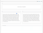
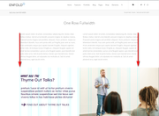
Thanks for the screenshot, you can accomplish this by using a color section in the middle of your page because it has 100% browser width while other columns have the page widths. For example I tested with a special heading then two 1/2 columns and then a color section in which I added the image as a background:

which gave me:

you could use an very wide image that is one half white and add your text section over that half, that is how this section on the Enfold Demo is created:

backend:

On my test page I forced the very wide color section background to browser full-width with this css:#av_section_1 { background-size: contain !important; }you would change the ID to a custom ID for the color section.
then since my page width was already set to stretch I used this css to make the text section above have a max-width of 1210px#main > .main_color > .container { max-width: 1210px !important; }Please give this a try.
Best regards,
MikeFebruary 10, 2020 at 6:33 pm #1183175Ok cool – cheers.
I kinda half followed what you said and got the result I wanted.
I put in a colour section with a custom height in pixels, with two columns in it, put all the text/buttons etc in the left column and kept the right one empty, then added an image to the background that was just white on the left side and the photo on the right, set background repeat to ‘Stretch to fit’, image position ‘Center Center’.
But then, for all intents and purposes that I can see I don’t need any of the CSS or to add a custom ID to the section…?
Thanks for your help.
February 11, 2020 at 1:51 pm #1183465Hi,
Glad to hear that you have found a solution that works with your requirements. Since you did this a little different you won’t need the css above. Unless there is anything else we can assist with on this issue, shall we close this then?Best regards,
MikeFebruary 11, 2020 at 3:38 pm #1183546Yes, no worries, close away.
Thanks for you help, everyone.
February 11, 2020 at 5:10 pm #1183599Hi,
If you need additional help, please let us know here in the forums.
Best regards,
Jordan Shannon -
AuthorPosts
- The topic ‘Setting container width of one half of grid row?’ is closed to new replies.
