-
AuthorPosts
-
December 14, 2019 at 8:38 pm #1165932
Hi,
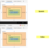
My italian version is translated into a spanish version.Despite everything has exactly the asme settings (css, php, them settings), the container in the spanish site is slightly smaller and I cannot figure out why.
Italian site
Spanish site
Also, on the spanish site (because of the smaller size of the container) the title is not going below as it should. How do I make the title to stay always down no matter the size of the screen?
Mike had helped me here but the title staying below does not work. REFERENCE TO THIS TICKET https://kriesi.at/support/topic/breadcrumb-above-post-title-plus-other-info/#top
Could you please help?
Thanks,
MarcoDecember 17, 2019 at 2:14 am #1166625Hey marcoabis81,
Thank you for the inquiry.
The maximum width of the containers on both languages is exactly the same. They probably look different because of the length of the menu, but the containers themselves have the same width.
You can use this css code to keep the post title in a different line below the breadcrumbs.
#top #wrap_all .post-title {
	clear: both;
}
Best regards,
IsmaelDecember 17, 2019 at 2:24 am #1166626Hi Ismael.
Thanks for the clarification. That’s what I noticed too but I could not understand.
Is there any way I can make the site narrower?
I would like to have them both a both narrower no matter the length of the menu.
Thanks
December 17, 2019 at 5:10 pm #1166920Hi,
I took a look at your screenshots were you had marked from the edge of the featured image to the sidebar divider and both od your sites are 1105px, both of the titles are in the same place, under the breadcrumbs.
I do note that the Spanish breadcrumbs are longer, because the Spanish language has longer words. But we can make the Spanish site 20px wider so the breadcrumbs are on one line, if that helps.html[lang="es-ES"].responsive #top #main .container.template-blog.template-single-blog { max-width: 1330px !important; }or if you want the Italian site 20px smaller, try this css:
html[lang="it-IT"].responsive #top #main .container.template-blog.template-single-blog {
	    max-width: 1290px !important;
}
Best regards,
MikeDecember 17, 2019 at 5:27 pm #1166922Hi Mike,
thank you so much for this, I might use it, it is actually a great thing.But I needed assistance with something else.
The width of the 2 website seems to be the same in numbers but the italian one appears larger than spanish one. Like if it has a smaller padding/margin left and right.
And I am trying to understand why I get this difference.
I Actually like most the way the spanish site appears, with bigger margins on the sides.
But still, the values of both the sites are the same, so why this difference?
thanks,
MarcoDecember 17, 2019 at 5:44 pm #1166925December 17, 2019 at 5:55 pm #1166927December 17, 2019 at 6:26 pm #1166933Hi,
Sorry, I’m not sure why you are experiencing this, what browser are you using? Please check that zoom is not turned on in one of them, and I assume that they are both the same browser.
I created a video for you in the Private Content area of what I’m seeing.Best regards,
MikeDecember 17, 2019 at 6:35 pm #1166935Hi,
Yes I am using chrome and same browser, same zoom.Not sure why it is doing that. I also have cleared the cache but same result.
December 19, 2019 at 1:12 pm #1167709Hi,
I will ask for the team to take a look and see if they also see your issue. Thank you for your patience.Best regards,
MikeDecember 19, 2019 at 2:05 pm #1167732Hi Marco,
I could see the difference in width on my end.
Your italian site is narrow and the maximum width of the container is set to 1130px.
While the spanish site is wider and the maximum width of the container is set to 1310px.
Can you give us temporary admin access to your site? so we can try to check your backend.
Please post the credentials in private content so it’s only visible to you and us, moderators.Best regards,
NikkoDecember 19, 2019 at 2:09 pm #1167734Hi Nikko,
if you have accesses to the site 20 minutes ago I was doing some tests and so I changed the size from 1310 to 1130 on both sites. But now all of them are set at 1310 and i still see the difference.Credentials below
December 19, 2019 at 3:29 pm #1167775Hi marcoabis81,
Can you try to check it again? it’s now on the same width on my end.
In the Italic Enfold Theme Options, I tried to add.responsive .container { max-width: 1310px; }After inspecting the link you gave the css was regenerated and was producing the right width, so I removed the code I added and that seems to have fixed the issue.
Let us know if it’s fixed on your end as well.Best regards,
NikkoDecember 19, 2019 at 3:44 pm #1167780December 19, 2019 at 4:34 pm #1167803Hi marcoabis81,
I’m using Google Chrome as well on a Windows 10 pc.
I checked it again, and tried in Icognito mode and it’s accurate on my end.
Can you try to clear your browser cache? if that does not work, can you try to add this code in Quick CSS (IT):.responsive .container { max-width: 1310px; }Best regards,
Nikko -
AuthorPosts
- You must be logged in to reply to this topic.


