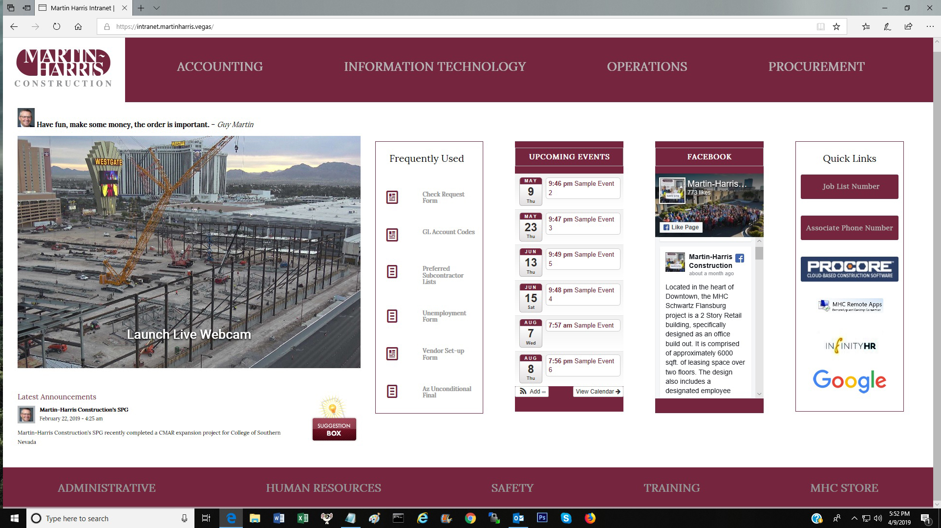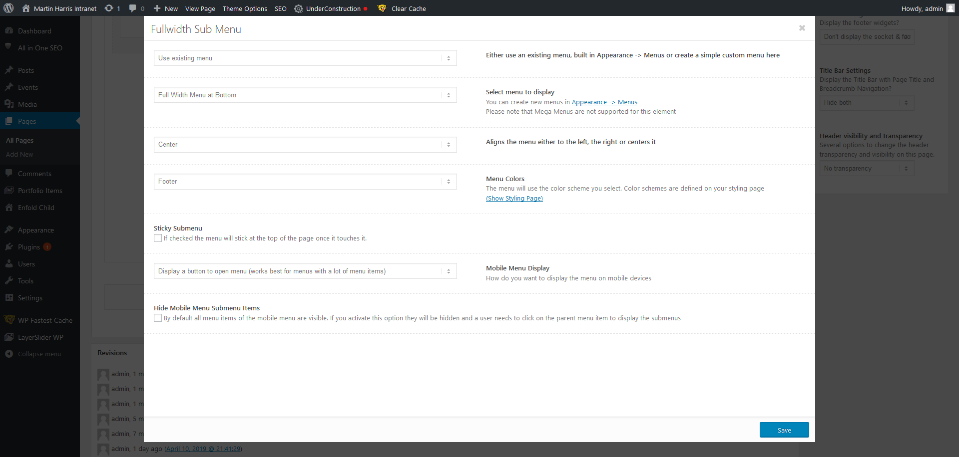
This is also in Reference to open ticket #1088042 you can see code snippets used to style the Full Width Sub Menu element for this build.
I am using the Full Width Sub Menu on this website see screen shot below and logins to live site in Private Area

When viewing the site on a mobile device ( Portrait and Landscape orientations ) the bottom Full Width Sub Menu element was not formatting correctly. So I went into to edit the options for that element and selected ” Display a button to open menu ( works best for menus with a lot of menu items ) then saved and updated. See Below

However after doing that , no menu at all shows up on mobile devices in both ( Portrait and Landscape orientations ). So instead of a menu button, no menu at all is showing up (distorted or otherwise). See Below in portrait mode , it’s just a colored bar at the bottom. No Menu Button

So not sure why there is no Menu button at the bottom of Mobile Page View using that setting , If you have any ideas or another way to allow the bottom sub menu to work on mobile that would be great , otherwise The Full Width Sub Menu element formats correctly on all other devices and browsers.
Hey webworm72,
Thank you for using Enfold. And we would like to apologize for the late response.
The sub menu container displays fine on mobile view. It’s not displaying a button but the menu items are there. We can’t adjust the settings because the user account is not an admin.
Screenshot: https://imgur.com/a/FJwGwLL
Best regards,
Ismael
thanks Ismael
you can close this ticket
Hi,
If you need additional help, please let us know here in the forums.
Best regards,
Jordan Shannon
