-
AuthorPosts
-
April 5, 2019 at 4:33 am #1087334
Hello,
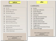
I am experiencing a mobile issue with the Icon List elements. As you can see when visiting from a mobile device, the Carriers section at the bottom of this page https://troyins.com/personal/
I’ve tried using this code:@media screen and (max-width: 750px) {article.article-icon-entry.av-iconlist-empty {
font-size: 30px !important;
line-height: 40px !important;}}But it didn’t work. Can you help?
Thanks,
LFApril 6, 2019 at 7:36 am #1087705Hey liliaf,
Please try the following in Quick CSS under Enfold->General Styling:
@media only screen and (max-width: 767px) {
.page-id-2 #av_section_2 .av_one_third {
  padding:0 !important;
}
}
Best regards,
RikardApril 9, 2019 at 2:52 am #1088496Hi Rikard,
thanks for the code, but the issue still remains. Can you help? Is that code for all pages? The item appears on more than one.
Thanks,
LFApril 9, 2019 at 3:36 am #1088506Hi Rikard,
I’m also seeing image alignment issues on several pages on the mobile site. If you go to https://troyins.com/personal/ you will see the images below “CHECK WITH US FOR ALL YOUR INSURANCE NEEDS” are aligned to the center.
If you go to https://troyins.com/commercial/ you will see the images below “WE SPECIALIZE IN:” are aligned to the right. They are aligned to the center in the page builder and I can see that no other modification has been made.
Thanks,
LF
p.s. I’m also including login creds.April 13, 2019 at 6:04 pm #1090410Hi,
Please try this code in the General Styling > Quick CSS field or in the WordPress > Customize > Additional CSS field:@media only screen and (max-width: 767px) { .responsive #top #wrap_all .flex_column.avia-builder-el-18,.responsive #top #wrap_all .flex_column.avia-builder-el-20,.responsive #top #wrap_all .flex_column.avia-builder-el-22 { margin-bottom: 0px !important; } #top .avia-builder-el-19 .av-iconlist-small .iconlist_content_wrap,#top .avia-builder-el-21 .av-iconlist-small .iconlist_content_wrap,#top .avia-builder-el-23 .av-iconlist-small .iconlist_content_wrap { min-height: 24px !important; } }expected results:

After you add the css, be sure to clear your browser cache.Best regards,
MikeApril 17, 2019 at 1:16 am #1091717Hi Mike,
I tried the code given and things are still the same. The text still gets cut off and the items are not aligned. As seen here:
https://troyins.com/wp-content/uploads/2019/04/IMG_0380.jpg
and here:
https://troyins.com/wp-content/uploads/2019/04/IMG_0379.jpgAlso, I have this image as the non-sticky logo, and it isn’t showing: https://troyins.com/wp-content/uploads/2019/04/Troy-logo-trans-1.png
I have tried on several devices and browsers. Please help ASAP,
LFApril 18, 2019 at 5:35 am #1092260Hi,
It looks like your site is giving this css somewhere, please check, if you find it please remove:@media screen and (max-width: 750px){header {margin-bottom: -10px;}}Otherwise we will try to ovoverwrite, please try this css:
@media only screen and (max-width: 767px) {
#top.page-id-46 #av_section_2 .flex_column_table_cell {
padding-left: 0px !important;
}
#top.page-id-46 #av_section_2 .iconlist_content_wrap > header.entry-content-header {
margin-bottom: 0px !important;
}
}
Best regards,
MikeApril 19, 2019 at 2:19 am #1092529Hi Mike,
Thanks. That code did align most things correctly. However, items are still misaligned on http://troyins.com/health
However, the code I removed
@media screen and (max-width: 750px){header {margin-bottom: -10px;}}
left me with a white space between the header and content on mobile.
Also, the logo is still missing from all desktop pages.
Please help,
LFApril 19, 2019 at 4:36 am #1092547Hi,
For the gap please try this css instead:@media screen and (max-width: 750px){ main.content { padding-top: 25px !important; } }For the logo issue, please try this css:
@media only screen and (min-width: 989px) {
#top .av_header_transparency.av_alternate_logo_active .logo a > img {
    opacity: 1 !important;
}
}
Best regards,
Mike -
AuthorPosts
- You must be logged in to reply to this topic.
