-
AuthorPosts
-
September 20, 2018 at 11:59 pm #1012531
I am hoping to be able to this in Enfold
there are two buttons get started and view rates. But when you click on the get started it will give you two options > Purchase or refinance. Can this be done?
September 21, 2018 at 8:15 am #1012675Hey park13,
This is possible using Code block and custom js script but would require knowledge in html, css and javascript however Enfold doesn’t have the option to do this with ease.
You can try to find plugins that might have this type of functionality.Best regards,
NikkoSeptember 21, 2018 at 8:50 am #1012683that littel mini navigation on the buttons – will be hard to insert but the rest will be fine with ALB Elements .
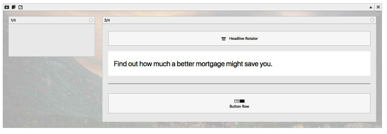
i would do it with a color-section with background-image and min-hight of 100%
in it 1/4th 3/4th column – and in the 3/4 everything left aligned.
1) a headline rotator
2) a heading
3) button rowPS : dear Mods the transition from typewriter animation is bad styled – because the background goes from transparent to font color when rotation starts – why that? leave it transparent ! As in the example of park13
see below typewriter animation!Result with fading see here: https://webers-testseite.de/park13/
September 21, 2018 at 10:34 am #1012706i changed on headline_rotator.js the line 83ff to :
//mark text
_self.$current.css('background-color', 'transparent');
i think this would be a better look
September 21, 2018 at 5:08 pm #1012839Guenni007, Can you explain in detail how you created the typewriter animation in details? How can I do this?
September 22, 2018 at 1:28 pm #1013051this is my ALB setup for the example page:

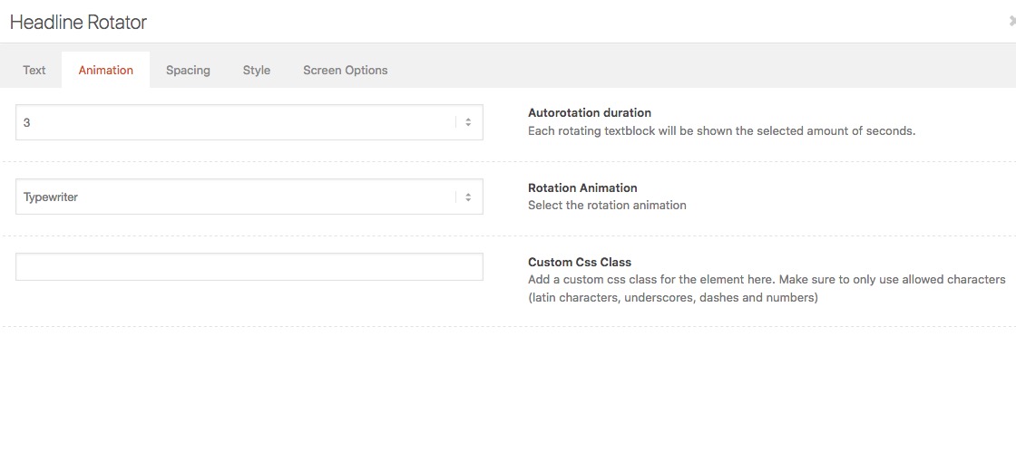
on your headline rotator – there is on top a tab “Animation” :

there you can choose Rotation Animation: and then typewriter.
On default there was a not so nice transition – i changed it in alb element – but it seems to work with css as well..av-marked-text .av-rotator-text-single { background-color: transparent !important; }to get the carret bigger:
.av-caret .av-rotator-text-single:after { border-right-width:8px; padding-left: 15px } -
AuthorPosts
- You must be logged in to reply to this topic.
