Hey CyborgBBR,
Thank you for using Enfold.
Could you please provide a screenshot of the issue? The following thread might help.
// https://kriesi.at/support/topic/playing-with-new-demos/
Best regards,
Ismael
Hi,
Glad we could help :-)
Please let us know if you should need any further help on the topic or if we can close it.
Best regards,
Rikard
Hi,
Please replace the css modification with the following css code.
@media only screen and (min-width: 768px) {
    #home-top-head .avia-slideshow-inner {
        min-height: 583px !important;
        max-height: 583px !important;
    }
}
Best regards,
Ismaelf
Hi!
I use the enfold theme with woocommerce. I filled out the description field of the product category. The description is shown on the top, over the products. Now I would like to have the description unter the products.
Is this possible? Maybe with an css in my child theme?
Thanks & all the best!
Sorry I forgot to mention that another one post open is this: https://kriesi.at/support/topic/right-align-last-main-menu-item-while-other-main-menu-items-remain-left-align/#post-892897
I also mentioned this problem in the resposiveness issues thread just in case….
Thanks and great support!
Hello Victoria,
Thanks for your answer… It does work fine in 2 mobile devices I have tested (portrait and landscape) Thanks! Only one point..I´m using css hero for styling the menu tabs…and if I choose the readymade style that I have chosen, I do need the line height 26 px for the text being situaded in the middle of the button…Otherwise, the text is positioned too far on the top…. Now I can see the social icons ok in mobile…but, I still have the burguer icon too high…. Is there any other way for changing this?
Thanks in advance,
By the way: I have posted some responsiveness issues here: https://kriesi.at/support/topic/responsive-general-issues/ .. They are the last amendments needed to submit or web….just in case you want to take a look
Hi,
Please try the following in Quick CSS under Enfold->General Styling:
#top #wrap_all .av-burger-overlay .av-burger-overlay-scroll #av-burger-menu-ul li a {
  color:white !important;
}
Best regards,
Rikard
Hi,
Great, glad we could help :-)
Please let us know if you should need any further help on the topic or if we can close it.
Best regards,
Rikard
Hi,
Thanks for that. Please try the following in Quick CSS under Enfold->General Styling:
@media only screen and (max-width: 1024px) {
#top #wrap_all .slide-entry {
    width: 100% !important;
    margin-left: 0 !important;
}
}
Best regards,
Rikard
Hi,
If you want to apply the same padding then you try to add a class to your header element within the Color Section, you can name it header-padding for instance, then add this to Quick CSS:
.header-padding {
  padding-top:175px !important;
}
Best regards,
Rikard
Hi, I would like to take this opportunity to express my gratitude to all of you.
I have two questions, which I believe you have already received many times. However, I cannot find the answer at the forum.
Question 1: Each of your demo is marvelous indeed. I feel tempted to borrow one page from another demo to the imported default demo. Is it possible? If so, which is your recommended way?
Question 2: The default demo requires WooCommerce plugin. When I click Site Title at the top-left corner, I can choose between “visit site” and “visit shop”. Does this mean that I can create both normal and shopping page together at a single site?
I am building website for my consulting business and will create simple web site for my clients. Above questions are important for me to buy more licenses of this wonderful theme. I am looking forward to hearing from you soon at (Email address hidden if logged out)
Thankfully yours,
Hi John,
No problem, first off please activate debug mode in order to see builder shortcodes: http://kriesi.at/documentation/enfold/enable-advanced-layout-builder-debug/
You can then paste the following shortcode to a new page:
[av_section min_height='' min_height_px='500px' padding='default' shadow='no-shadow' bottom_border='no-border-styling' bottom_border_diagonal_color='#333333' bottom_border_diagonal_direction='scroll' bottom_border_style='scroll' scroll_down='' id='' color='main_color' custom_bg='' src='' attach='scroll' position='top left' repeat='no-repeat' video='' video_ratio='16:9' video_mobile_disabled='' overlay_enable='' overlay_opacity='0.5' overlay_color='' overlay_pattern='' overlay_custom_pattern='' av_element_hidden_in_editor='0']
[av_heading tag='h1' padding='15' heading='Color Section' color='custom-color-heading' style='blockquote modern-quote' custom_font='#000000' size='40' subheading_active='' subheading_size='15' custom_class='' admin_preview_bg=''][/av_heading]

[av_textblock size='' font_color='' color='' admin_preview_bg='']
The color section is the most powerful layout element in your arsenal to build unique websites. it allows you to display fullwidth section that contains various elements, and also lets you set the styling of this section by changing background images and color, height, top and bottom border, etc

A color section is a fullwidth element that can not co-exist beside a sidebar. You can however display a sidebar below the last fullwidth element if you want to.

Below are a few color section examples
[/av_textblock]
[/av_section]

[av_section min_height='custom' min_height_px='500px' padding='huge' shadow='no-border-styling' bottom_border='border-extra-diagonal' bottom_border_diagonal_color='#ffffff' bottom_border_diagonal_direction='' bottom_border_style='' id='' color='main_color' custom_bg='' src='https://test.kriesi.at/enfold-2017/wp-content/uploads/sites/24/2015/07/business-office-work.jpg' attachment='480' attachment_size='full' attach='fixed' position='center center' repeat='stretch' video='' video_ratio='16:9' overlay_enable='aviaTBoverlay_enable' overlay_opacity='0.7' overlay_color='#000000' overlay_pattern='' overlay_custom_pattern='' av_element_hidden_in_editor='0']
[av_heading heading='This is a color section with fixed background and slanted border' tag='h1' style='blockquote modern-quote modern-centered' size='40' subheading_active='' subheading_size='15' padding='0' color='custom-color-heading' custom_font='#ffffff' admin_preview_bg='rgb(34, 34, 34)'][/av_heading]
[/av_section]

[av_section min_height='25' min_height_px='500px' padding='huge' shadow='no-border-styling' bottom_border='no-border-styling' bottom_border_diagonal_color='#333333' bottom_border_diagonal_direction='' bottom_border_style='' id='' color='main_color' custom_bg='#ffffff' src='' attachment='' attachment_size='' attach='scroll' position='top left' repeat='no-repeat' video='' video_ratio='16:9' overlay_opacity='0.5' overlay_color='' overlay_pattern='' overlay_custom_pattern='' av_element_hidden_in_editor='0']
[av_heading heading='This is a color section with solid background' tag='h1' style='blockquote modern-quote modern-centered' size='40' subheading_active='' subheading_size='15' padding='0' color='' custom_font='#ffffff' admin_preview_bg='rgb(255, 255, 255)'][/av_heading]
[/av_section]

[av_section min_height='' min_height_px='500px' padding='huge' shadow='no-border-styling' bottom_border='no-border-styling' id='' color='alternate_color' custom_bg='' src='https://test.kriesi.at/enfold-gym/wp-content/uploads/sites/18/2016/02/hero-2.jpg' attachment='549' attachment_size='full' attach='fixed' position='center center' repeat='stretch' video='https://www.youtube.com/watch?v=oXdzvMLiE7Q' video_ratio='16:9' video_mobile_disabled='aviaTBvideo_mobile_disabled' overlay_enable='aviaTBoverlay_enable' overlay_opacity='0.8' overlay_color='#000000' overlay_pattern='' overlay_custom_pattern='']

[av_heading tag='h1' padding='0' heading='This is a color section with background video and some content elements' color='custom-color-heading' style='blockquote modern-quote modern-centered' custom_font='#ffffff' size='40' subheading_active='' subheading_size='15' custom_class='' admin_preview_bg='rgb(34, 34, 34)'][/av_heading]

[av_one_fifth first min_height='' vertical_alignment='' space='' custom_margin='' margin='0px' padding='0px' border='' border_color='' radius='0px' background_color='' src='' background_position='top left' background_repeat='no-repeat' animation='' mobile_display='']

[/av_one_fifth][av_three_fifth min_height='' vertical_alignment='' space='' custom_margin='' margin='0px' padding='0px' border='' border_color='' radius='0px' background_color='' src='' background_position='top left' background_repeat='no-repeat' animation='' mobile_display='']

[av_textblock size='' font_color='' color='' admin_preview_bg='']
<p style="text-align: center;">Lorem ipsum dolor sit amet, consectetuer adipiscing elit. Aenean commodo ligula eget dolor. Aenean massa. Cum spellentesque eu, pretium quis, sem. Nulla consequat massa quis enim.</p>
[/av_textblock]

[/av_three_fifth][av_one_fifth min_height='' vertical_alignment='' space='' custom_margin='' margin='0px' padding='0px' border='' border_color='' radius='0px' background_color='' src='' background_position='top left' background_repeat='no-repeat' animation='' mobile_display='']

[/av_one_fifth][av_one_fifth first min_height='' vertical_alignment='' space='' custom_margin='' margin='0px' padding='0px' border='' border_color='' radius='0px' background_color='' src='' background_position='top left' background_repeat='no-repeat' animation='' mobile_display='']

[av_font_icon icon='ue822' font='entypo-fontello' style='border' caption='Lorem Ipsum' link='' linktarget='' size='40px' position='center' color='' admin_preview_bg='']
Lorem ipsum dolor sit amet, consectetuer adipiscing elit. Aenean commodo ligula eget dolor.
[/av_font_icon]

[/av_one_fifth][av_one_fifth min_height='' vertical_alignment='' space='' custom_margin='' margin='0px' padding='0px' border='' border_color='' radius='0px' background_color='' src='' background_position='top left' background_repeat='no-repeat' animation='' mobile_display='']

[av_font_icon icon='ue80e' font='entypo-fontello' style='border' caption='Multi Media' link='' linktarget='' size='40px' position='center' color='' admin_preview_bg='']
Lorem ipsum dolor sit amet, consectetuer adipiscing elit. Aenean commodo ligula eget dolor.
[/av_font_icon]

[/av_one_fifth][av_one_fifth min_height='' vertical_alignment='' space='' custom_margin='' margin='0px' padding='0px' border='' border_color='' radius='0px' background_color='' src='' background_position='top left' background_repeat='no-repeat' animation='' mobile_display='']

[av_font_icon icon='ue82f' font='entypo-fontello' style='border' caption='Cloud Based' link='' linktarget='' size='40px' position='center' color='' admin_preview_bg='']
Lorem ipsum dolor sit amet, consectetuer adipiscing elit. Aenean commodo ligula eget dolor.
[/av_font_icon]

[/av_one_fifth][av_one_fifth min_height='' vertical_alignment='' space='' custom_margin='' margin='0px' padding='0px' border='' border_color='' radius='0px' background_color='' src='' background_position='top left' background_repeat='no-repeat' animation='' mobile_display='']

[av_font_icon icon='ue826' font='entypo-fontello' style='border' caption='Big Brother' link='' linktarget='' size='40px' position='center' color='' admin_preview_bg='']
Lorem ipsum dolor sit amet, consectetuer adipiscing elit. Aenean commodo ligula eget dolor.
[/av_font_icon]

[/av_one_fifth][av_one_fifth min_height='' vertical_alignment='' space='' custom_margin='' margin='0px' padding='0px' border='' border_color='' radius='0px' background_color='' src='' background_position='top left' background_repeat='no-repeat' animation='' mobile_display='']

[av_font_icon icon='ue863' font='entypo-fontello' style='border' caption='Time is up' link='' linktarget='' size='40px' position='center' color='' admin_preview_bg='']
Lorem ipsum dolor sit amet, consectetuer adipiscing elit. Aenean commodo ligula eget dolor.
[/av_font_icon]

[/av_one_fifth][/av_section]
Best regards,
Rikard
Hi Tom,
Thanks for that, if you go to Appearance->Menus and activate Description in Screen Options at the top right hand side of your screen then you will be able to remove that text under each menu item. If you should need any further help then please post admin login details in private.
Best regards,
Rikard
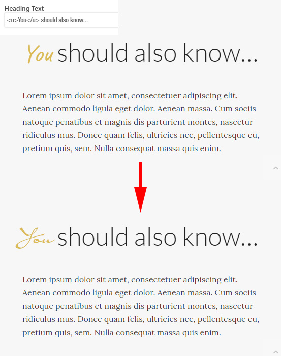
OK, maybe I’ve not made this clear. My apologies. I’ll include a screenshot of an area of the screen that’s most of the way down the HOME page.
This version of Enfold comes pre-packaged with a script font that seems to activate when using the underline tag. From what I can make out in ENFOLD > ADVANCED STYLING > (Select a custom element to customise) > Select the <u> underline tag, it was using a font called “Caveat”. So when I used the underline tag in the headings, the word(s) between the tags were changed to this Caveat font…a script font.
All I wanted was to install the Riposte font so I could customise the underline tag to use Riposte. If I look in the list of fonts available to me in that list, Riposte isn’t available. Furthermore, I don’t know how to undo what you did as it looks pretty bad….can’t have two different script fonts together.
So all I wanted was for the Riposte font to be installed so that when I use the underline tag, it uses Riposte instead of the default font that this theme uses (as I say, I’m pretty sure it was Caveat).
Hopefully this image will help you to see what I need. The header text area from the backend is shown in the top left corner…(and again, many thanks for your help).
Thanks, but unfortunately, this still leaves a wide space on the top of the page above the menu, where the socket used to be.
Any reason why the disabling the submenu socket in quick css is causing this issue? We’d ideally like the submenu socket to be hidden on the desktop, and have the pages load right below the header…
Hi,
Yes, I took away the code to hide the header secondary menu (top socket) from Quick CSS till this issue is resolved.
When I put the code in, I get that gap between header and page content area.
@media only screen and (min-width: 990px) {
#header_meta { display: none !important; }}
This screenshot will show you how it looks when the code is put back in.
Hello Enfold,
Great theme! Michelle here. I’m not good with CSS, hoping you can help me with the small bar above main menu camarin.org
I’m already using the following quick css (to make the font larger and remove the border between main menu and small bar above main menu) , Enfold general styling:
#header_meta { border: none !important; }
#header_meta a {
font-size:17px !important;
}
.av-special-heading-tag a {
text-decoration: none!important;
font-style: normal!important;
}
Hey accurIT,
Try this css at the bottom of your custom css:
#header.header_color.av_header_transparency #header_main {
    background-color: rgba(232, 188, 84, 0.5)!important;
}
.page-id-85 #header_main {
    background-color: #fff !important;
}
The idea is that the top part of the code has a stronger value when the page is not scrolled, and the bottom part of the code does when the page is scrolled. Please try to remove your original colored custom code and Please clear any cache plugin and your browser cache.
Best regards,
Mike
Hey Sal,
Try this code in the General Styling > Quick CSS field:
span.logo {
top: -40px !important;
}
Best regards,
Mike
Dear Kriesi team,
I’m trying to figure out, how I can adjust the layerslider’s position on the page.
I installed the Play By Scroll demo and used these layers to configure my own pictures.
But even after deleting the rest of the template layers, which were on the top of the page
the slider is still placed on the bottom of the page and you need to scroll down endlessly
until it appears in the viewport.
There’s no entry in the jQuery DOM advanced settings and the slider is implemented via
shortcode into an empty page (except the slider).
What can I do to move the whole slider to the top of the page (still fullscreen)?
Kind regards
Miriam
Hi,
I changed your image to fixed from parallax, because at mobile view the image was behind the header with the background set to contain. For laptop to desktop view I set the image to cover so it would fill the screen. For mobile & tablet view I moved the special heading up to mid screen, as it was below the image.
This is the code I added to the General Styling > Quick CSS field to do all of this:
#home-screen {
background-size: contain !important;
}
@media only screen and (min-width: 1130px) {
#home-screen {
background-size: cover !important;
}
}
@media only screen and (min-width: 460px) and (max-width: 546px) {
#top.home .avia-builder-el-1 {
margin-top: -50%;
}
}
@media only screen and (max-width: 459px) {
#top.home .avia-builder-el-1 {
margin-top: -90%;
}
}
Please clear your browser cache and check.
Best regards,
Mike
Hello,
I need help getting the iframe to adjust to smaller screen right now 2 pages where i have iframe get cut off on the phone. I am using code blocks on those pages and just have the this:
<div class=”track”>
<iframe src=”http://track.mtnvly.com/cgi-bin/wbprotrk?=&button=TRACE” width=”100%” height=”100%” >
</iframe>
</div>
I have also tried adding this styling:
.track-container iframe {
position: absolute;
top:0;
left: 0;
width: 100%;
height: 100%;
}
.track-container {
position: relative;
padding-bottom: 56.25%;
padding-top: 35px;
height: 0;
overflow: hidden;
}
to try and make it responsive. Do you have any other suggestions I could try, thank you for your help.
Kevin
Hi,
What you can do, is simple add the logo on the menu :)
And then, the menu item that has your logo, add a class that hides it on desktop and it is visible on mobile only.
That is the easiest way to make it work, with not tons of hacks.
Best regards,
Basilis
Is there any way I can move the logo so it’s on the top of the page, some in the secondary and some in the main header?
You can see how the logo in a little low, that’s because where the client login is, that is the secondary header. I want to move that logo up a little bit, so it’ll partially be on the secondary header as well. However, when I move the logo up, it goes underneath the secondary header/cuts off. Anything that can be done?
View post on imgur.com
Just to add on, this problem started, once I added in a CSS code to hide the display of the header secondary menu on the desktop and only have it displayed on mobile.
@media only screen and (min-width: 990px) {
#header_meta { display: none !important; }}
-
This reply was modified 6 years, 3 months ago by
 kaustubha.
Hi Victoria,
Sorry about the delay getting back to you.
I have removed the sidebar from the page. The standard layout has the image on top when there is no sidebar.
I would like it to the left in a 250×250 image square, but it has to scale for mobile.
I did some custom styling for the same layout but WITH a sidebar and all was working well. But after my client told me to deactivate the sidebar the whole setup no longer works. If I simply float the image left it does scale well on mobile and tablet. That is why I was hoping to keep the layout but “hide” the sidebar
What can you propose?
Hi christwars,
Here is the code you can put in Enfold > General Styling > Quick Css, if it does not work, put into themes/enfold/css/custom.css
#top #wrap_all  .price.price-unit.smaller del {
  display: none;
}
If you need further assistance please let us know.
Best regards,
Victoria
Hi amerzib,
The text is centered on my end

Here is the code for the tablet, you can put in Enfold > General Styling > Quick Css, if it does not work, put into themes/enfold/css/custom.css
@media only screen and (min-width: 768px) and (max-width: 1024px) {
  h4.module.text {
    font-size: 16px;
  }
  #top #wrap_all .all_colors h1.module.text {
    font-size: 16px;
  }
  .flex_column.av_one_fifth {
    min-height: 310px;
  }
}
If you need further assistance please let us know.
Best regards,
Victoria